 Reams upon reams have been written on landing page conversions.
Email conversions, however, somehow escape similar scrutiny.
Email, as you might know, is one of the best channels as far as ROI is concerned. Every $1 spent on email returns $40 in revenue.
Improving email conversions, thus, can have a massive impact on your revenue. A minor uptick in how well your emails convert can double or even triple your ROI.
Creating conversion-focused emails means using sound UI/UX principles. In this guide, I’ll look at some core UI/UX principles that guide email design. I’ll also cover essential UI elements you can use to boost your email conversions.
UI/UX Design Principles for Emails
Dealing with emails is entirely different from websites.
For starters, email once sent, is beyond your control. You can’t add pop-ups, change the layout, or use JavaScript to add interactivity the way you might on your website.
Instead, you rely entirely on your reader’s device and email client for conversions.
This poses significant limitations. While on desktop/mobile websites, you can safely assume that most of your users would be on modern devices using modern browsers, the same can’t be said for email.
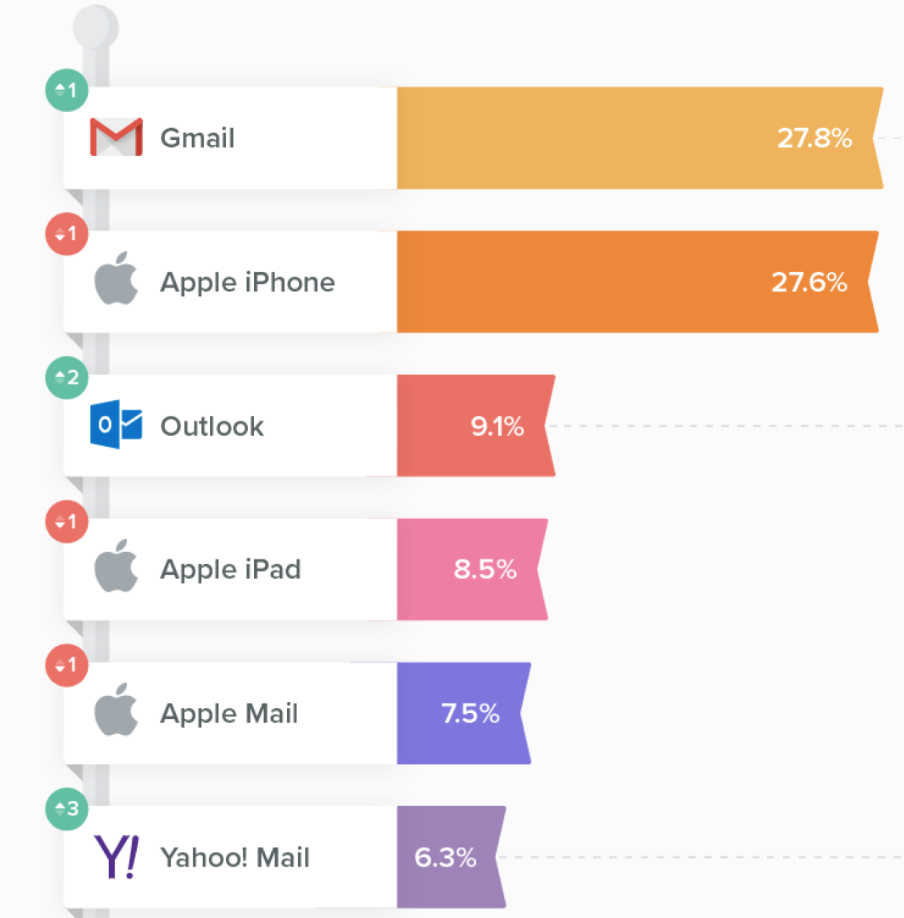
There is substantial fragmentation in the email client and device landscape. As Litmus reports, Gmail and iPhone top the email clients chart, but smaller players like Yahoo and Outlook have enough market share to not be ignored.
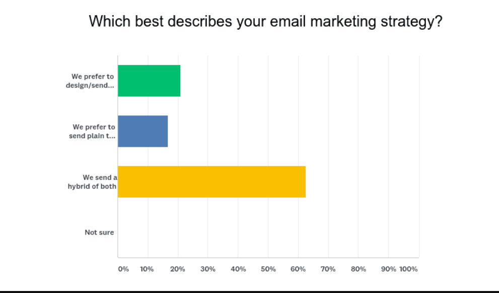
Some users also prefer getting text-only emails (or in some cases, their email clients only support text emails). This is why a majority of marketers prefer using a combination of plain text and HTML emails.
Keep in mind that email is a passive push channel. Once users have signed up for your newsletter, they don’t have any control over how and when they receive communication from you. This is unlike a website where a user has to actively click a link or type in a URL to reach your website.
All these usage preferences impact UI/UX principles for email when it comes to conversions:
1. Email open rate is critical
Your email is competing with dozens, even hundreds of others in a user’s inbox. Before you can even dazzle them with your brilliance, you have to first ensure that they click your email.
Subject lines become a vital weapon in this fight. A crisp, clear subject line with an enticing promise gets users to open your email.
I understand that this comes under the purview of copywriting, but it is so important to conversions that it deserves a mention here.
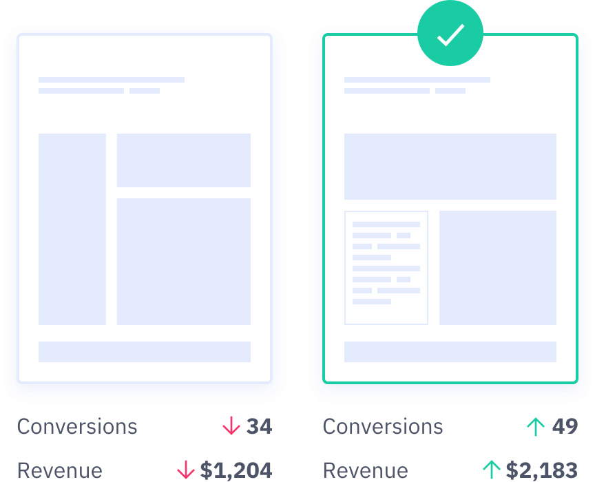
Testing is crucial for subject line success. Two subject lines are good, five are better. Brainstorm dozens of lines, run them through a A/B testing regimen, and create a project dashboard to track open and click-through rates.
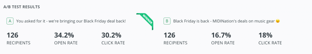 (Image source: MIDINation)
Do this for multiple sets of subject lines until your open rates at least match, if not surpass industry benchmarks.
2. Mobile users are the top priority
The inevitable march of mobile is nearly complete; nearly three-fourth of all users read emails on their smartphones over desktops.
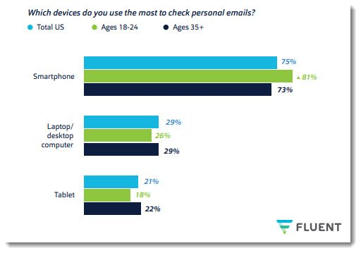 The younger your audience, the more the mobile-desktop split will be in favor of mobiles.
Designing emails for mobiles poses several UI/UX challenges:
- Mobile users might be on limited data connections, limiting your ability to use multimedia in emails
- Mobile screens have limited screen real estate, forcing you to design shorter emails
- UI elements have to be larger to improve touch-friendliness
Since you can’t really control how and where users open your emails, you have to adopt responsive, but mobile-first design. Any design element you choose should look good on both desktop and mobile, though mobile should get top priority.
3. Design for clarity
Email exists in a different context than a web landing page. You’re not just competing against other websites; you’re also competing against hundreds of unread emails and, on mobile, countless notifications.
Given these constraints, you have limited time to grab your audience’s attention. Every email you design has to make its purpose clear right from the subject line. Any pixel that doesn’t relate directly to your offer is a pixel wasted.
This focus on clarity manifests itself in countless ways. Your emails must follow an information hierarchy, your CTAs need to be clear, and your copy must be succinct. Any link you add must be easy to follow – lest you trigger spam filters.
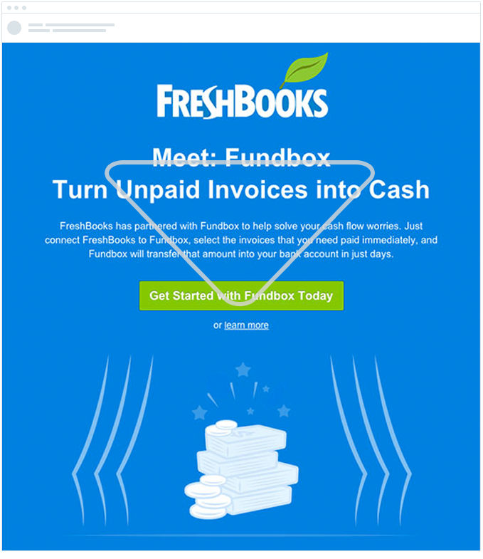
For example, notice how Freshbooks uses an ‘inverted pyramid’ information hierarchy in its newsletter:
(Image source: CampaignMonitor)
This makes it easy for readers to understand your value proposition without digging through paragraph after paragraph of text.
While following UI/UX design principles is important, you can also boost your results by using conversion-focused UI elements.
I’ll cover some of these UI elements in the next section.
7 Must-Use UI Elements in Emails
UI and UX usually get clubbed together but they are quite different beasts.
As any experienced designer will tell you, UX covers how users interact with your web page, email or app. It defines the theory of user behavior.
UI (User Interface) is the real-world manifestation of UX principles.
If UX posits that CTAs must be easy to tap, the UI would replace text links with large buttons. If UX argues that readers read in an ‘F-shape’ pattern, the UI would be oriented from left to right.
Using the right UI elements at the right time, thus, can have a positive impact on not just conversions, but also usability.
Let’s look at some such UI elements that can boost your email conversions.
1. Large CTAs
CTAs are easily the most important element in any email – it is, after all, what you want people to click/tap on.
Your CTAs should be large and clearly visible on any conversion-focused collateral – email, landing pages, etc. The narrow constraints of email design, especially on mobile, demand that the CTA be:
- Easy to identify as a CTA through clever use of colors, shadows, and text
- Accompanied by easy to follow text
- Placed in strategic locations throughout the email, such as ‘above the fold’
For instance, note how this email uses an easy-to-spot, page-spanning CTA. You couldn’t miss it even if you tried:
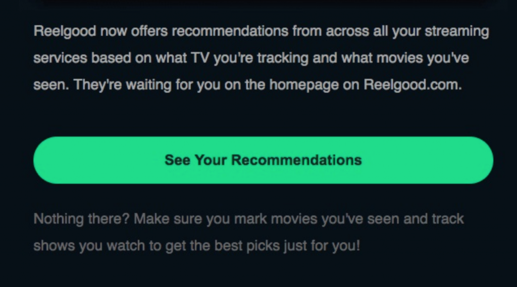 (Image source: ReelGood)
2. Animated GIFs
If you want to show your product in action – always a positive a conversions – it is tempting to throw a video into your emails.
Don’t.
Video doesn’t convert nearly as well in emails as it does on webpages. For starters, a lot of your users might be reading your email on mobile devices. Opening a video on mobiles consumes data, creates noise, and often takes users away from their email client.
As the NN Group quotes a participant in an email usability study:
“I probably wouldn’t watch this. It’s a video, not text. I expected an article, not a video. With video, you have to watch the whole thing. Even if it’s just a minute, I’m not into watching video. And if I was on the phone, I couldn’t watch it. I wouldn’t want to watch it on my phone, anyway.”
But there is a workaround to using video in your emails: animated GIFs.
Animated GIFs can show your product in action without forcing users to watch an entire video. It might not have the production qualities of video, but it consumes less data, doesn’t have any audio, and can be used on any device or email client.
For example, this email shows different design variations for a piece of jewelry via animated GIFs:
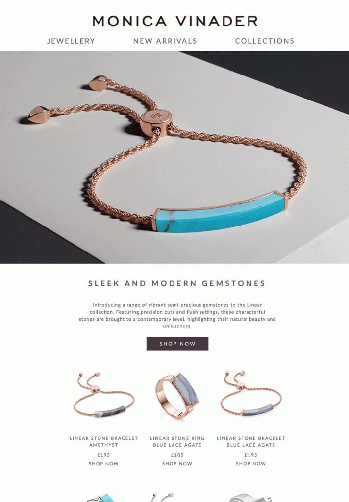 (Image source: MonicaVinader)
3. Clear value proposition
What is your email really about?
If readers can’t answer this question within seconds of opening your email, they’ll likely press the back button.
A clear and upfront value proposition should be the first thing you add to any email. Make it visible as soon as someone opens your email, right after your brand assets (such as your logo).
For example, this email from Uber makes it clear that it is all about the ride pass program:
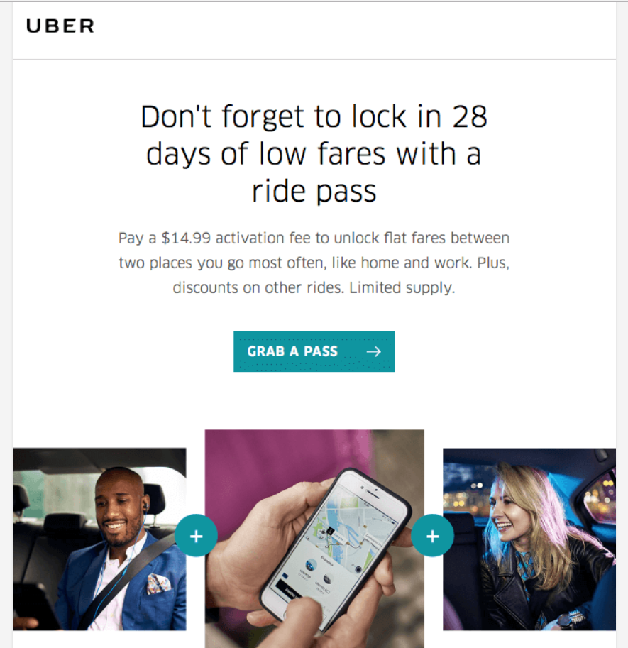
Try structuring your emails around this value proposition. Adopt the reverse pyramid information hierarchy I mentioned earlier. Every element you add to the email should reinforce it in some way.
4. Directional cues
You can’t talk to your users and tell them what to focus on in your emails, but you can guide their attention with directional cues.
Directional cues are design elements that nudge the reader in a particular direction. These can be subtle, such as a faint line running across the page, or they can be bold, such as an arrow pointing to a CTA.
The purpose of these cues is to guide the reader’s gaze as he/she scrolls down the email.
Here’s an example of an overt directional cue pointing straight to the CTA:
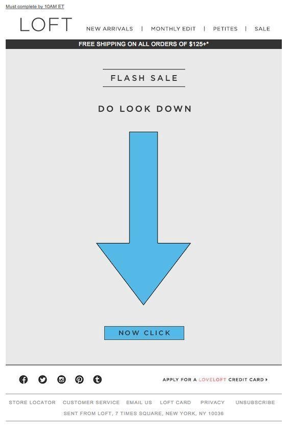 (Image source: Loft)
Here’s a more subtle example from Chanel. Instead of an arrow, this email uses a graphic that gently points downward towards the CTA. The reader’s eyes would naturally trace the direction of the graphic and notice the CTA.
 (Image source: Chanel)
Try to use directional cues for any element you want to draw attention to. This can be a CTA, a discount coupon, a new feature, or an offer.
5. Contrasting color CTAs
I talked about using large CTAs that dominate the screen and grab the reader’s attention.
However, size is not the only way to make your CTAs pop. You can also use contrasting colors to help them stand out in any email.
For example, this CTA uses a bold orange color that contrasts completely against the dark blue of the background. This acts as a visual cue for readers to pay attention to the CTA.
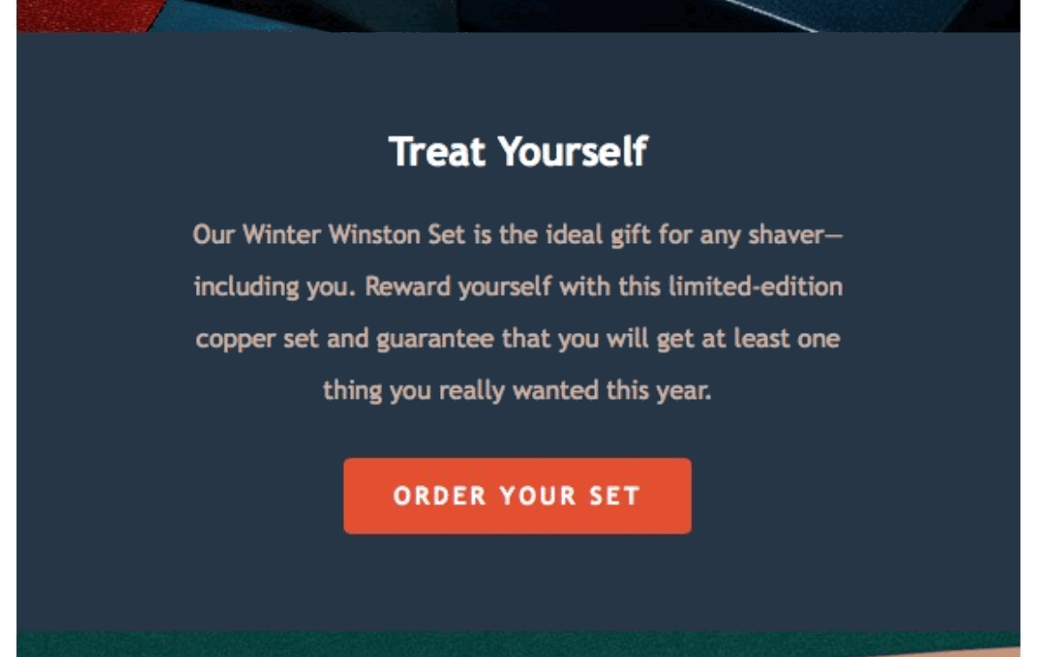
(Image source: Harrys)
Colors on the opposite end of the color wheel, i.e. complementary colors, tend to work best as the CTA and background.
Try using this tool to look up your brand’s dominant color. Use its complementary color on the color wheel as either your background or your CTA.
6. Scarcity and urgency indicators
A user who reads your emails is typically in a passive mental mode. He might have a backlog of emails to read; even as he is reading yours, he is already thinking about the 20 other unread emails cluttering his inbox.
Getting such a user to click away and take action, thus, can be incredibly challenging.
One way to compel action is to use scarcity and urgency markers.
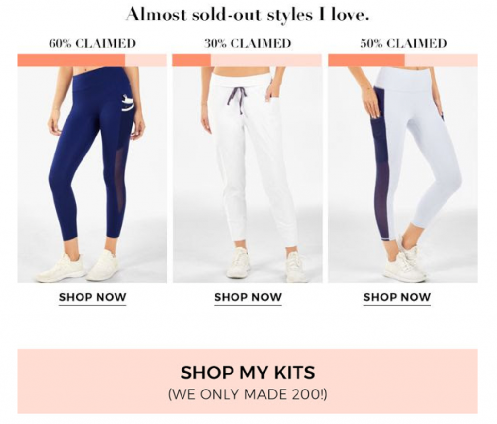
Scarcity indicators are design elements that indicate a product, service, or offer is scarce, i.e. it’s in limited supply.
For example, Fabletics shows readers how many items have been sold to indicate limited availability.
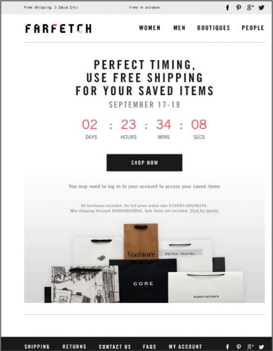
Urgency markers achieve the same goal as above but instead focus on time instead of quantity.
The easiest way to show urgency is by using a countdown timer. It clearly tells readers that an offer is available only for a limited time.
See this email from FarFetch as an example:
7. Use irrelevant links sparingly
Sometimes, removing a UI element can boost conversions more than adding one.
This is particularly true when you’re dealing with action-focused emails (such as a sale offer) vs information-focused emails (such as an email about new launches).
It can be tempting to add links to your blog, Twitter feed or Instagram page in action emails, but all they do is eat into your share of CTA links.
Brands are particularly guilty of adding social media links in their email footers.
Conclusion and Over to You
There is no quick panacea to email conversions; you have to follow sound UI/UX design principles and use the right UI elements.
While the email design guidelines will vary from brand to brand and email to email, using the above UI elements can help you boost conversion rates. Try a split test with these UI elements and measure the impact on your core metrics.
I’m sure it will be positive!