
For many websites, desktop traffic may still bring more searches than mobile, and for the last few years, responsively designed websites have dominated the web as the format of choice to satisfy all users. Responsively-designed sites use CSS3 media queries to serve the same content to mobile and desktop users using a fluid grid and a flexible design to automatically adapt to the size of a user’s screen.
 However, we also need to understand mobile optimization so we get the most out of mobile user search traffic.
Mobile optimization refers to optimizing a website specifically for mobile devices.
Instead of simply compressing and slightly rearranging the content on the screen, you design the entire experience for smaller screens. Mobile first design!
If you have ever been bored commuting on a train and you opened a website on your smartphone device, you know it can sometimes be a frustrating experience.
If you’ve ever accessed a website on a mobile device, you know it can be frustrating. Tiny buttons and links, endless scrolling, and unclear form fields create hassles that often result in abandonment.
People are busy, stressed out, and impatient. They won’t wait for a slow page to load or spend hours trying to figure out how to add a product to their carts.
It all boils down to friction. The more friction a website creates, the less likely a customer becomes to convert.
Friction occurs when there’s a barrier to conversion. If a customer has to work harder than necessary to achieve a goal, he or she feels friction. It makes that customer want to avoid the experience entirely.
So let’s say for example I was looking to purchase tickets for a day pass to go the beach, and I search “Tod’s Point Beach Pass” on my mobile device and the first result is the town of Greenwich CT’s government site, and it looks like this.
 As you can see from the screenshot, it’s not mobile friendly so I have to pinch, scroll and otherwise to manipulate the screen to find and read any of the information on the website. If I want to buy a ticket it sends me to another web page that again is not mobile friendly.
Each of these annoyances creates friction. Many mobile users will simply abandon their search because they’re out of time or patience.Mobile optimization helps encourage conversions by reducing friction.
In the first quarter of 2016, the global conversion rate for desktop computers was 3.63 percent. That’s anything to brag about. But when you compare it to the global conversion rate for smartphones was a pathetic 1.30 percent.
However, the global conversion rate for smartphones was an abysmal 1.25 percent. Now bear in mind that mobile device usage has skyrocketed over the last few years. Not only does mobile search surpass desktop, but even more interesting is the fact that mobile users spend twice as minutes on their devices than desktop and laptop users. The phone is addictive. As a brand or marketer knowing this data stats, it becomes fairing evident that mobile optimization is not optional anymore for businesses. You may be wondering how can it affect my website’s conversion rate.
A site optimized for mobile experiences can make the conversion process smoother and less stressful for the user. Some of the characteristics include features such as:
- Larger buttons
- Smaller images
- Auto-fill form fields
- Auto-detect location settings
- Guest checkout option
- Multiple screens instead of scrolling
All of these types of features help to reduce friction. If a person can purchase a product or request a consultation from your mobile site without getting frustrated and bouncing off your website, then your business will likely benefit from the user’s experience.
8 Mobile Optimization Strategies for 2018
 Now that we have gone over some of the most relevant aspects of optimizing for mobile website users, how do you go about incorporating them into your strategy? There are several ways to design and tackle mobile optimization, so let’s talk about this topic in a broad sense. Now it also depends what kind of business or website you have and what are you trying to offer to people visiting it. So many developers, when they design for apps and mobile sites, tend to gravitate toward the preference of a having clean, minimal design look and feel, but that is not always so easy to do when you have an e-commerce brand or a site that offers a lot of different services. You have to get creative sometimes. Let’s dive deeper into a few of the most effective strategies right now.
1. Choose 100% responsive web design option
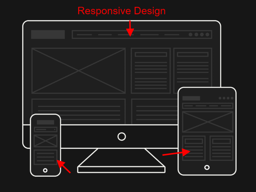
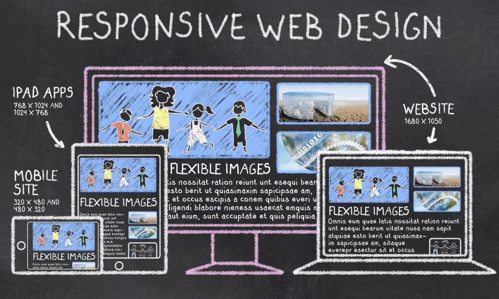 The easiest way to start optimizing for mobile users and web traffic is to redesign your website using a what is called responsive web design. Responsive websites expand or contract to the screen size of the device on which they are being viewed. You may notice that is shaped like a square and has horizontal lines going across it, this is called the “hamburger” menu which usually appears instead of a top navigation bar, and images are compressed smaller. One thing to keep in mind is that responsive design is slightly different than mobile optimization. Mobile optimization starts with responsive design — it gives you the foundation or building blocks to create a 100% mobile-friendly site.
When viewed on a mobile device, a mobile-optimized design looks quite different from a responsive website. A mobile site is configured with the mobile user in mind and can have a separate URL. the images are compressed lighter to reduce page loading speed, the buttons are sized bigger to accommodate touch screen and peoples fingers, and the need of having to pinch and scroll is to see the content is eliminated.
Responsively designed websites take care of most of these elements. The website will look good on a smartphone and will be easy to navigate for users, which is the first step in improving your conversion rate on mobile device viewing. The great thing is that there a ton of themes in WordPress and other CMS frameworks such as Bootstrap that come with HTML5 responsive design features built in.
2. Implement structured data
Structured data has been all the rage for techies and SEO nerds over the last few years. And structured data allows Google and other search engines (Yahoo, Bing, etc) to display rich snippets. What is a rich snippet? A rich snippet is a piece of Schema Markup (HTML code) that you add to your website and it allows you to markup different types of content give search engines more information about a page.
 Rich snippets can sometimes appear above paid ad and organic search results in a Google SERP. If your restaurant sell’s supplies and you also publish recipes on your blog, users who come to your site may have found your recipe by seeing them on Google as a rich snippet. The basic instructions can be listed right in the SERPs. There also something called “Featured Snippets” that is being used for by Google and Bing to rank a webpage as “position 0” to answer a search query, which often the content is structured as a list or in simple to follow steps.
For the Search phrase “Chicken Carbonara” Google is showing a cooking recipe instructions webpage as the “Featured Snippet”.
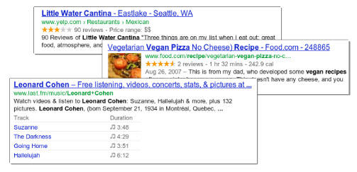
 There several types of rich snippet microdata markups, which is this screenshot show websites search results and they have star ratings and reviews, and upcoming event or concert dates listed in the results.
 You can use Schema.org to find the schema markup you need for structured data. When you correctly add and implement structured data, Google can rank you more accurately in the SERPs and have a better understanding of the content and purpose of your website’s pages. Now as of now Schema markup is not a direct ranking signal, but having clear, concise rich snippets can result in higher click-through rates, as users can quickly and easily determine whether the content on your site is what they’re looking for.
3. Compress the file size of your images
 Reducing image size improves performance, and improved performance means satisfied users. Your users demand a fast, engaging experience across all of your digital properties. The problem is that, large image files can bog down your website’s page loading speed and make your site feel “heavier.” Compressing your images with a WordPress plugin such as Adaptive Images can help deliver the best combination of size, quality and file format suited for each image, browser and device.
If you are using a separate URL for your mobile users, consider using different, smaller images. The reason being is so that graphics don’t overwhelm the screen or cause loading delays, especially on slower wifi connection areas like 3g or less. If you have an e-commerce website with a lot of product images, the need to find the balance between find a large enough image for users to view it clearly but have it small enough that it loads fast on mobile. Instead, just trying relying on resizing the images thru CSS, which is how responsive websites work, you can choose to upload a smaller image that will not weigh down your site for your mobile traffic.
Tip: make eCommerce product images expandable
 Retail customers expect sites to let them view high resolution closeups of products. Users got frustrated when they are not able to see what they were buying more close up or they are not inside the brick and mortar store.
4. Identify non-mobile friendly features
Your website may have elements that do convert perfectly to mobile devices. The usually are found on the right or left side of a desktop version of a website. Some of these sidebars are static and some may move down as you scroll also known as being “sticky.” No matter they widen the page, on a mobile device, a sidebar can make the body text unreadable-again, without pinching my screen. Now if you have a responsive website, the sidebar will usually get pushed down, showing up below the blog post in the vertical format. Take a brief look at our at one of our blog posts that is rendered on a desktop computer.
 See the sidebar?
Now, let’s look at that same post rendered on the Samsung Galaxy: No more sidebar. It makes reading my blog posts on mobile devices, such as smartphones, much easier.
 The same goes for an e-commerce website. You want to remove any unnecessary clutter.
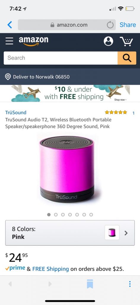
Let’s compare these two product pages from a Trusound Audio Bluetooth speaker on Amazon. The first is the desktop version.
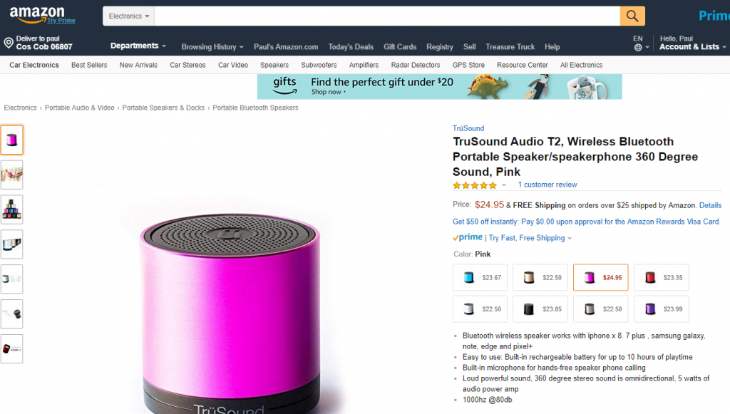 There’s a lot going on on this page. Let’s compare it to the mobile-optimized version on a Samsung phone:
 5. Test popup usage
 5. Test popup usage
 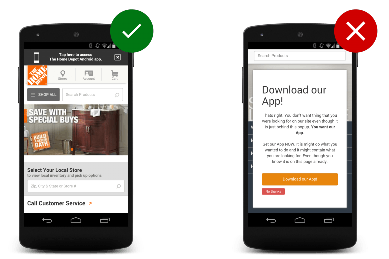 Popups can be a great way to convert users into giving you information taking an action, but only when they not to annoying or create friction between the website and the user. Especially on mobile screens, popups can be frustrating because users do not know how close if they are not interested in what the popup is offering.
Now we are saying that you should not take advantage of them, but we recommend that you consider A/B testing them to determine whether they have an impact on bounce rates and other important KPIs. Sumo published an article where the author Sean Bestor found that “Sumo users collected 23,645,948 email addresses with List Builder pop-ups in less than two years.” He goes on to assert, “Pop-ups work. There’s just a misunderstanding about what makes a successful pop-up (that isn’t annoying).”
Popups may work for your company, but if they are converting or making people bounce consider disabling them. Also do make assumptions that don’t work either until you have tested them.
6. Incorporate adding videos
Sometimes on a mobile device images can be a bit limiting. Because you have either stack them on top of one another, create a carousel, or place them side by side in rows. They can take up a lot of room on the screen, Now adding and using video can help to engage your visitors, both visually and aurally without disrupting your website’s design or the consumer’s experience.
Product or service explainer videos, for example, work pretty well for helping visually describe a product or service key benefits to a user. You can also create mini commercials or use product videos to demonstrate how it works. Test different video options to see what your audience enjoys most. Another thing, as the founder of MOZ Rand Fishkin, did with his series Whiteboard Friday, (WBF) is creating educational content to balance out your text-heavy blog posts.
7. Flash is bad don’t use it
This may seem weird to even be discussing using Flash in 2018, but as we digress; flash elements slow down parts of your website and rarely render well on a mobile device. As a Google Developer Common mobile mistakes article states “Some types of videos or content are not playable on mobile devices, such as license-constrained media or experiences that require Flash or other players that are not broadly supported on mobile devices. Unplayable content, when featured on a page of any website can be very frustrating for users.”
When users visit a page with content not supported on a mobile device, they will see an error message similar to the one below:
 This provides users with a crappy mobile experience for your users!
Instead of using a proprietary video player or putting content in unsupported formats, we recommend using HTML5 standard tags to include videos or animations.
For animated content rendered using Flash or other multimedia players, consider using HTML5 animations that work across all web browsers. Google Web Designer makes it easy to create these animations in HTML5.

It does not matter if you have an Android or iPhone, neither operating systems support flash. So if your company’s website is still living in the 2005 development era, just know that people will not be able to react with well with your website online. The mobile era is about low power devices, touch interfaces, and open web standards – all areas where Flash falls short. The mobile web has adapted, with more sites embracing HTML5 for websites, games and apps.
8. Speed up your checkout page
 Again if you have an eCommerce site, your checkout page, is where you especially want everything to load executive smoothly. There have a few studies done on the subject of cart abandonment, and the rates tend to range between 55 and 80 percent. Now, this is a huge issue for many eCommerce websites, when they are relying on people to actually buy their products or services. So, on the high side, if 80% of people abandon their shopping carts, then they are losing revenue. And on mobile devices cart abandonment can be even higher, again because of increased friction. If the user is having difficulties completing their checkout due to poorly design form fields or other problems, you have lost lase and possible repeat customer. What can you do?
Well, speeding up the checkout page can be helpful. First, try only asking for information you actually need to complete the sale. As an example, must always ask where did the customer hear about your company? Maybe not. Instead of letting them process the purchase as a guest, is really necessary to make them create an account just to buy some designer perfume? ‘
By removing these obstacles, you will increase the chances of conversion.
A few Examples of the Best Mobile Optimized Websites
There many websites that have invested and are excelling at delivering mobile-optimized experiences. The mobile versions of there sites perform well across devices, which results in favorable experience. Buzzfeed is one that has really nailed and understands millennial mobile users. Their website is always focused on providing a good user experience. So it’s not too surprising that is optimized for mobile in a beautiful and functional way.
The first thing I would like to mention is the well-proportioned hero image on the first article on the page. On the desktop site, it is much larger. Second, BuzzFeed has shortened their navigation menu down to the basics, thirdly it reduced the information on subsequent articles, making them easier to consume on a small screen.
Another mobile site worth noting is an eCommerce one called Zappos, Its offers a clean, uncluttered look and is users for users to navigate. Also, the customer service phone number is featured right at the top of the mobile screen.
 If you look at the featured I have highlighted with green arrows, you can see all the areas that Zappos have made bigger for your eye to gravitate towards.
You have the search feature, which is large so people with bigger hands won’t have trouble. The customer service number is clearly visible, and there’s an obvious “SHOP NOW” CTA.
That’s the homepage, but what about product pages? Zappos hammer’s those, too.
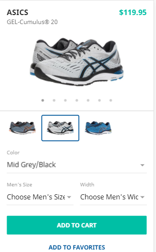 You get all the information you need without any color. I also like how they handle different views of the pair of shoes as well as the color variations.
Speaking of popups earlier, let’s take a look at Abercrombie & Fitch’s mobile site. The company displays a very well-designed use of a popup.
 it’s easy enough to click that crystal-clear X in the top, right-hand corner and make the popup go away. I also like the use of color here and the understated header.
Mobile Optimized Vs Responsive Design?
This will come down looking at your analytics and what type of business you are. If the majority of your users visit via a mobile device, mobile optimization will provide the most value, But let’s not discount the usefulness of HTML5 responsive design for making your website accessible to your mobile viewers. It is not going to be as user or conversion friendly as a pure mobile-optimized site. Many large brands will make mobile sites, AMP pages, and progressive web apps. If type into Google “shop Macy’s” on my mobile site I am taken to a separate mobile site with the different mobile URL https://m.macys.com.
For most companies that do not have a bunch of in-house developers, using a custom responsive theme is the way to go, because it makes maintaining your site easier thanks to single URL, and you do not have to worry about managing 2 versions of your site. When deciding whether to rely on exclusively on having a responsively designed site or to go with a mobile site, figure out why you might need mobile optimization in the first place.
- Do you run an e-commerce store like Shopify or Bigcommerce?
- Can people make purchases on your site?
- Do you collect significant information from visitors via forms?
- Does your site look strange or difficult to navigate in its current iteration?
- Have people complained about your site on mobile?
If you find yourself answering these questions with a “yes”, then you may want to consider mobile optimization. Also, it’s important to get feedback from your users. You could consider polling audience to ask the experience for using your site. Which users visit via mobile. Could complete or find what they were looking for? Do they have any complaints? You also could reach you email subscribers for feedback.
Conclusion
Mobile conversion optimization isn’t a fad. It’s an excellent way to boost conversions on your website among mobile users.
Reducing friction in the mobile browsing experience will result in fewer frustrated consumers. If people can check out your products, read reviews, compare different products, and make purchases without getting stressed out, you won’t have as many abandoned shopping carts.
Mobile conversion rates are much lower than desktop and laptop conversion rates. There’s a reason for this, and it might boil down to a lack of mobile optimization.
Follow my 8 tips for making your site as appealing and useful to mobile users as possible.
Even if you only implement one or two of my suggestions, you might see a significant uptick in conversions on mobile.


