It should go without saying that your website’s homepage will make or break a visitor’s user experience. First impressions do matter, right? There’s a small window of just a few minutes -or a few seconds- to make a lasting one; showcasing the best assets of your brand or products and ensuring that navigation is concise and smooth. Understanding how the customer journey works in this scenario and applying the right strategies will not only churn out satisfied visitors or customers but more moolah as well. Here are 8 tips for upgrading the layout of your homepage for improved visibility and navigation.
Table of contents:
- Banner Elements Stay Above the Fold
- “But wait! There’s more!” (Below the Fold Line)
- Finding Key Categories and List pages Should be a Breeze
- Sticky Menus Stay at the Top of the Page
- Make your CTA Pop
- Accessibility for All
- Play Around With Pop-Ups
- Need for Speed
- In Conclusion
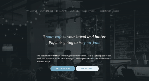
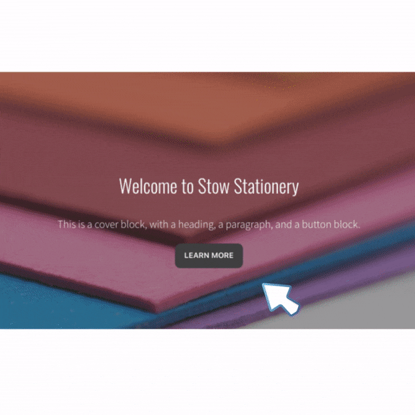
Banner Elements Should Stay Above the Fold
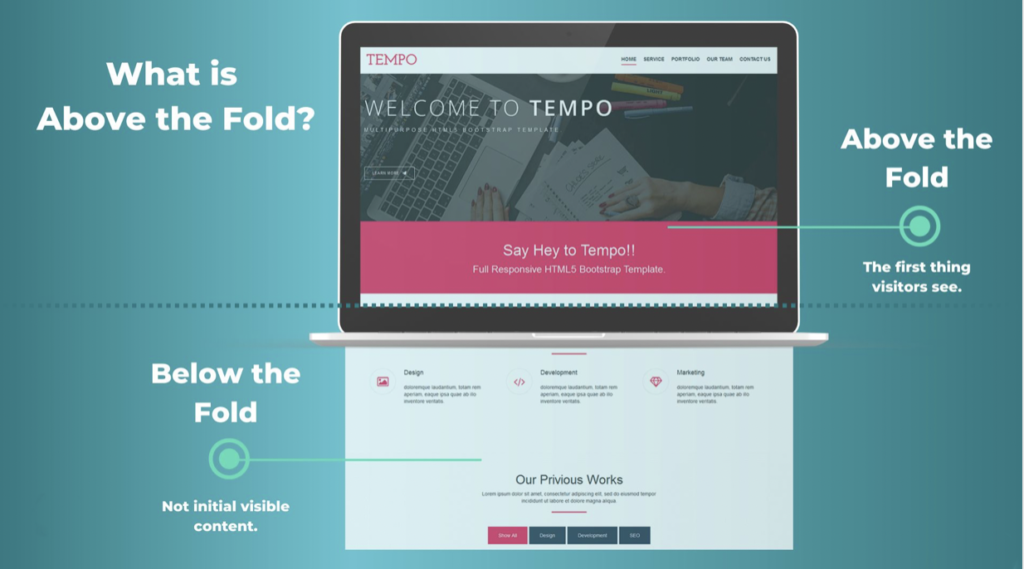
What does “above the fold” mean? Derived from newspaper industry terminology, above the fold refers to the upper half of a newspaper or tabloid front page where the headliner usually accompanied by a large photograph is printed. In this case, the elements included in this template is a banner with an equally enticing headline and call-to-action.
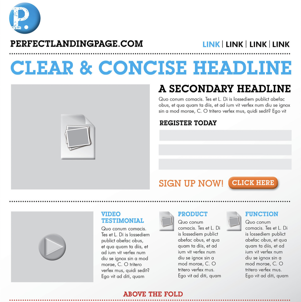
Usually, it’s the first thing visitors will lay their eyes on and this is where you want to stamp your brand’s core message – unless you want them to keep scrolling down.
If the customer has made it to your homepage from whatever origin, whether it be a referral, ad, or social media, they are likely in the interest stage of the customer journey. You have piqued their attention and you want to hold on to it for the remainder of their journey until you touchdown into the conversion stage.
How do you craft an effective banner?
- Aesthetically pleasing color scheme and appropriate stock photos
- Catchy headline and concise description of what your brand offers
- A strong call-to-action
There is no need to overthink it and pull out the works. As a matter of fact, that could be a distraction and a turnoff for first-time visitors. Follow this brief guideline, and you’re well on your way.
“But wait! There’s more!” (Below the Fold Line)
You’ve made it this far and consistency is key in securing a conversion. You’ve wowed your visitors with the feasibility of your webpage’s upper fold and you want to follow it up with equally engaging content as they continue to scroll down. Here’s all the more reason to show a little TLC to your below-the-fold line; a study by Google claims content and ads below the fold have 44% viewability compared to 73% viewability for above the folds.
Fortunately, you don’t have to go overboard to keep eyes glued to your homepage. Which takes us to the next step.
Finding Key Categories and List Pages Should be a Breeze
Navigating a webpage should be nothing but smooth sailing, as opposed to being a strenuous and annoying task. ‘Less is more’ is an important philosophy in this component of creating an improved homepage. Just like how one may be intimidated by too many options on a restaurant menu, too many options on a webpage will likely evoke the same feeling in those interested in learning more about a service or product. To make the user experience easier on the eyes – and wrist- and boost traffic include up to no more than 6 or 7 menu items in your main navigation. Each menu item should include brief yet descriptive titles that search engines can decipher and guess what’s on that page. In the case of companies with hefty yet necessary menu options, those can be delegated to drop-down menus with no more than two levels and/or fat footers.
Sticky Menus Stay at the Top of the Page
The sticky menu is an element that remains on the page, which is convenient for easy access when you want to explore other parts of the site without scrolling back to the top of the page.
There’s some skepticism that accompanies sticky menus as some find their constant presence bothersome. However, the pros outweigh the cons since sticky menus:
- Decrease bounce rates (the percentage of people who exit a site after viewing one page)
- Increase conversion since visitors can better explore purchase options
- Most importantly, your brand or logo is in view at all times which will be embedded in visitor’s memories
Sticky menus can be adjusted to fit at the top of the page as well as the sides, but it’s best advised to keep it at the top since it produces a cleaner-looking webpage.
Make Your CTA Pop
Call-to-action buttons moves the customer journey along, inching you closer to the coveted conversion.
The CTA is singlehandedly the most important element to a successful homepage and it’s absolutely crucial that the naked eye can see your prompt.

Here are a few tips to boost your CTA’s visibility:
- Use strong commanding verbs – While you can use the usual “buy”, “try” or “sign up”, don’t be afraid to use other enthusiastic examples such as “Join”, “Unlock”, “Discover”, or “Learn”
- Give them a reason! – Besides the obvious FOMO, detail the benefits of investing in your brand. Include sales and promotions if you must.
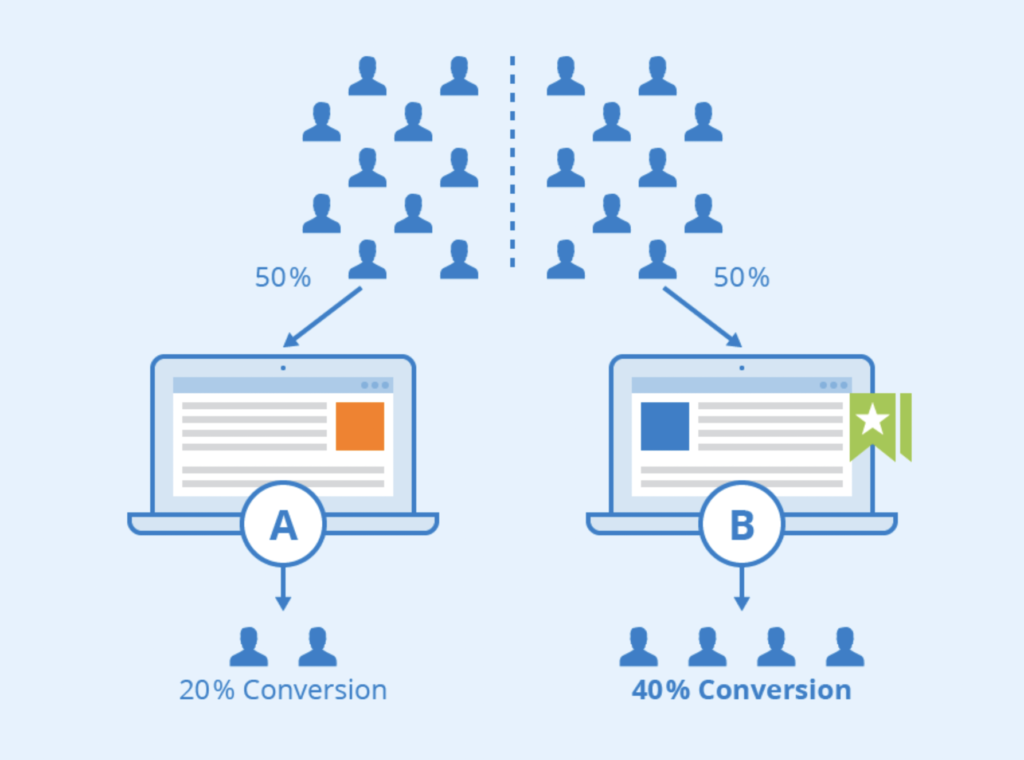
- Test drive – To ensure your CTA produces the best results, give ‘em a spin with A/B tests.
Accessibility for All

Alienating certain demographics is counterproductive to the homepage traffic.
An accessible and inclusive homepage covers all areas ranging from technical to physical.
An all-accessible site starts with responsive web design. Responsive web design is built to allow web pages to adapt and work smoothly on various devices including computers, mobile phones, and tablets.
Granted you’re already working with a CMS that supports website templates of this nature, you’re next step is to tailor text and images on your homepage so that it is better received by the hearing and vision impaired.
Adjust fonts so that they are easier to read and adhere to head song structures so your text can be read seamlessly. Include descriptive Alt Text in your images. Use equally descriptive language in links as well.
Play Around With Pop Ups

Pop-ups bring you one step closer to your goal of gaining a conversion. As a matter of fact, it’s the second to last step in the marketing journey: the Consideration Stage. Pop-ups often drive companies to home base since they provide subscribers with relevant information about the business or offers, encouraging them to make a well-informed purchase.
In a study of nearly 2 million pop-ups across the web conducted by Sumo, the following findings were compiled:
- The highest-performing pop-up in the 10th percentile has an average conversion rate of 9.28%
- 3 out of 100 webpages with pop-ups have conversion rates over 11%
- 3.09% is the average conversion rates for all pop-ups
Creating an effective pop-up includes some of the same advice previously mentioned to enhance other elements of a homepage. Here’s a quick recap:
- Use attention-grabbing colors and images
- Make sure your CTA is conspicuous as possible
- Your offers are detailed and persuasive and aren’t vague or a “secret”
- It has to be accessible to all (Responsive design; able to maneuver with both mouse and keyboard; text and imagery are visible; alt text)
There are other variables that must be taken into consideration as well:
- Timing is key – A pop-up that immediately appears upon entering a website or logging in is a nuisance for many and so it’s best advised to time your pop-ups to appear between 10 and 30 seconds into their webpage experience. As an alternative, pop-ups could be set up to appear when a visitor scrolls further down the homepage or you can even implement ‘exit-intent’ pop-ups that appear when a visitor attempts to leave a webpage.
- So is frequency – Pop-ups that appear after clicking on a new page are just as frustrating. Limit your website to 2 pop-ups max.
- And finally, testing – To get a better idea of what pop-up templates your visitors find the most engaging, conduct A/B tests.
Need for Speed

Implementing all of the aforementioned strategies would be in vain if your homepage’s speed brought visitors back to the era of dial-up. Both mobile and desktop webpages take about three seconds to completely load (with the first two seconds being the most crucial) and every second after that (up to five seconds) and your chances of securing a conversion start to dwindle – by 4.42%. Slow loading times can be troubleshot or avoided by
- Using a reliable, performance-based hosting provider – You get what you pay for couldn’t be any more true. Saving a few pennies by opting for a cheaper (or shared) host will result in your homepage’s loading times being delayed by overburdened servers.
- Compressing and optimizing images – Compression and optimizing images allow you to save and store images without compromising quality. Not only does this improve webpage speeds and conversions, but it’ll also give you a boost in SEO rankings.
- Caching webpages – Caching is the process of storing webpage data, including files, multimedia, script codes, or login information on your device, making them readily available when you re-visit a site. Caching speeds up internet browsing.
Conclusion
Think of homepages as your moneymaker, and as such you want to spend time carefully curating and organizing the aforementioned elements. The general premise of this list is to make your homepage (and pop-ups) aesthetically pleasing and detailed without being distracting or inaccessible, as it’ll hinder the customer journey. That can best be achieved by prioritizing the content above and below the fold; offering a handful of menu options on the page and relocating the rest into fat footers or mega menus. And of course, fast loading speeds tie everything else together. An easily navigable homepage is a surefire way to see gains in your ROI.