 Design is a secret language that lets brands tell their customers they know what they’re doing. It’s a social thermometer and a gauge. So where are we in design, now that it’s 2018, and what should mobile designers and startup brands be aware of? For a long time design has been associated with graphic design (“the look” of a product or website).
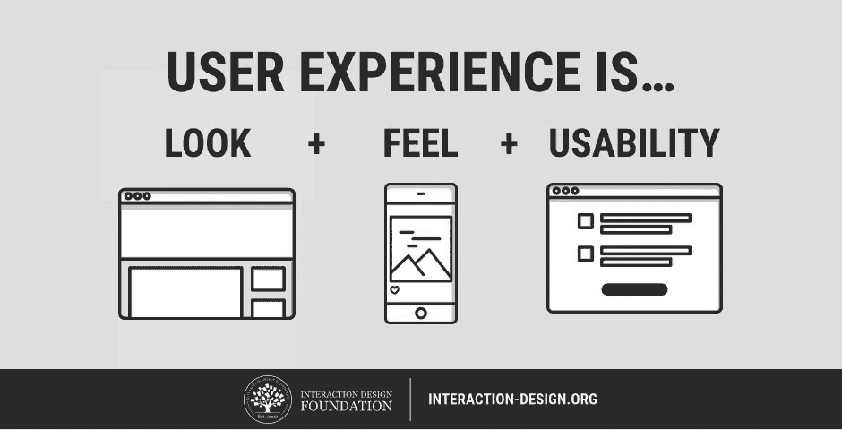
As digital technology and our expectations about digital interactions has grown, we’ have begun focusing more and more on “the feel” part of a design, also known as the user experience. Don Norman, the co-founder of the Nielsen Norman Group, is credited with inventing the term “user experience” in the 90s, stating that, “User experience encompasses all aspects of the end-user’s interaction with the company, its services, and its products.”
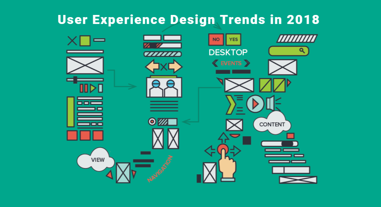
Here’s a list of (UX) design trends that are growing and shifting for 2018:
(From Interaction-design,org)
Photography Driven Interfaces
Photography has long been a mainstay of design, especially in the fashion and restaurant industries where the look of the product is a huge draw to the customers. In 2018, there are several factors making photography an important consideration, and also opportunity to inspire users, for even more industries. Instagram has fed a growing addiction to juicy photos that describe a theme, a brand, or even a whole lifestyle.
Another factor in all this is there’ve been a few very large-screen-phones introduced into the market in recent years. While the bigger-than-your-jeans-will-accommodate iphoneX had mixed reviews a few years back, Apple has announced an even bigger screen on this years iphone x2, Apple hyping their upcoming release as their largest phone yet. Samsung is also releasing a larger phone this year (the Galaxy S9) hyping not only the larger screen size but also their best camera so far. One thing photography enables that other design elements don’t is the possibility for users to contribute their photos to the platform (see Yelp and Google Maps).
As phones are getting larger, their built-in cameras are also becoming more powerful, and therefore users are getting more and more empowered to take good photos, whether or not they have the skill to harness it fully. If your app allows for user-generated content or fits the platform model (this may or may not turn into a trend in the coming years, as more startups start to think about ways to engage their audiences as successfully as YouTube does) then this is another way that photography can be used to drive the interface.
How to do it right: Take into consideration what is appropriate for the app. Larger and more high-res screens enable full-screen experiences that are increasingly able to absorb a user’s full attention (because phones weren’t doing that enough already) and some apps are removing text and other overlays from photos so that the user can really get an eyeful. Larger photos will place emphasis on the content of the photos, where they take the user emotionally or mentally, while smaller photos will reduce the importance of the photos. For a travel app, it makes sense to balance great photos of the destination itself with other significant information and tools.
How to do it wrong: Stock photography is out-growing its novelty, customers have seen stock photos ad nauseum at this point and are now easily able to identify dime-a-dozen stock photography when they see it. The abundance of casual photographers sharing their mastery of this art form on Instagram and elsewhere have driven up the bar. Beware of cheap imitations, they’re starting to stick out like a sore thumb.
Duotone
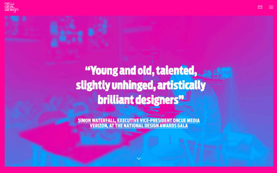
One of the more adventurous filters, duotone turns ordinary photography into a colorful backdrop for text and other elements. Duotone is easily done in Photoshop (just choose menu Image > Mode > Duotone) and you can find examples of it in marketing everywhere at the moment. Spotify is one of the prime movers of this technique and has been using it steadily for the past several years. The effect can look a little vintage and its charm may be due to wear off sooner than later, but I expect we’ll see some worthwhile experiments with duotone before it shows itself the door.
- How to do it right – Color choice. The never-ending struggle. As with well-chosen colors, well-done duotone will express an appropriate mood. We are in a time of vivid, bold colors (see section on Color below) and almost every color combination you can think of is being tried out somewhere. When in doubt, look to Spotify’s last several years of marketing campaigns for guidance on how to use Duotone in a way that amplifies text and brand at the same time. Most Duotone uses seem at least in part inspired by their example.
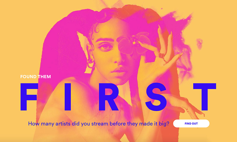
(Spotify has been using Duotone in their marketing for years)
• How to do it wrong – A crummy photo will yield a crummy duotone image, but raw ingredients aside, make sure the outcome is “legible” visually. If the two colors are too similar or too dark, and if it’s hard to make out what the image is, then it’ll make for a poor design element.
Colors
Everyone who asks me about design trends for the year asks about color. Color trends tend to change gradually, (I don’t know if you’ve ever noticed this, but appliances from the 70’s can be identified based on color alone) but designers are in agreement about one thing: the two terms to keep in mind about color this year are: vibrant, and unconventional.
For the last few years, I’ve made a new year’s habit of checking out the Pantone color of the year. As the company that literally specializes in naming and categorizing colors, and giving them something like brands and identities to some degree, I find it interesting to see their take. This year it’s UltraViolet 19-3838, possibly influenced by the recent passage of Prince which also inspired a Pantone color in his honor. The last several years’ color choices evoked peaceful, tranquil moods (‘17 was Greenery and ‘16 was a tie between baby-pink Rose Quartz and the powder-blue shade Serenity) and this year’s choice stands out as a gutsy departure.
From my own design experience, I can tell you, purple is a difficult color to work with. In America it’s associated with high degrees and philosophy and royalty (to a degree) but also with magic and mystery, making it a less-frequent color of choice for brands. The Alzheimer’s Association has chosen purple as its branding-awareness color (in hopes of garnering more attention to the issue, as breast cancer awareness has achieved by claiming pink) and we all know Yahoo is strongly associated with that color. Other than that, conventional brands have seldom ventured into the wilds of purple. It evokes Willy Wonka and Halloween. But that’s where things are taking a turn this year, it’s becoming increasingly necessary to make one’s brand stand out, and unconventional color choices are part of that change.
In the past, muted colors and conservative saturation spelled out trustworthiness and stability. For 2018 and beyond, bold colors that haven’t gotten a lot of use in the past are going to be seen a lot more often, as brands try to market themselves as unique, innovative, fresh and in tune with the needs of the moment.
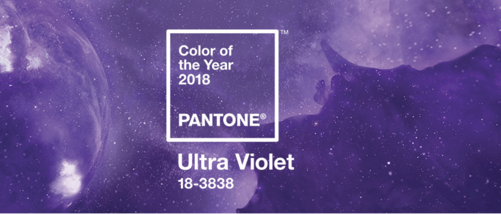 2018 color of the year is Ultra Violet- check out the trippy, spacey video Pantone created for it at pantone.com – evoking purple haze, the late great Prince, and “the mysteries of the cosmos”
More for 2018
Here are some other trends for 2018:
- Gradients – There’s a lot you can do with gradients and that’s part of the reason why there’ll always be a place for them (contrary to what many are saying about this trend, the 90’s does not hold copyright on gradients. Or pastels.) Following in line with the trend towards bolder colors, so the gradients made from those colors are also tending towards bold.
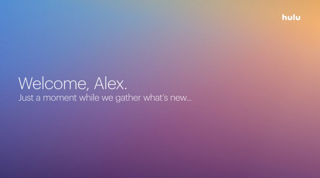
(From Hulu)
- Custom Illustrations – especially vector illustrations, though well-done hand-drawn illustrations are also effective. Lots of companies are using hand-drawn illustrations to give personality and playfulness to their brands. Also, cartoon characters turn out to be effective storytellers (many of us have known this since we were kids). Companies have often relied on instructional videos to teach their users how to use their products or even introduce audiences to the concept of their business, and often these videos have featured cartoon characters, perhaps because live action is often more expensive, but just as likely is the possibility that cartoons are effective at quickly telling stories. Either way, it’s an accepted and classy way for companies to educate their audiences about their services, and the aesthetic of these cartoons, which have often been in vector formats with simple characters, now has wide traction as still illustrations. Done well, illustrations create a sense of welcome and ease, making a user feel comfortable with a brand and new unfamiliar product.
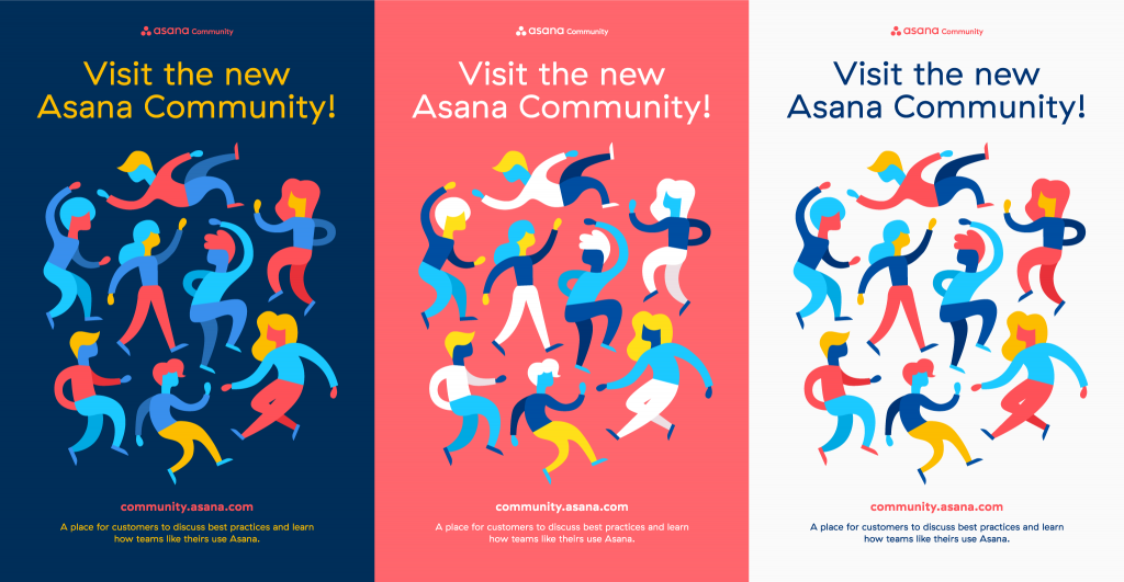
(From Asana)
- Semi-Flat – So a few years ago, around 2013 with the coming of ios 7, the design world was shaken by the sudden imposition of “super-flat” ui, imposed on everyone by the extreme flat-look of the ios 7 native apps and overall interface, and everyone scrambled to catch up. Away went realistic-looking textures and heavy drop-shadows, anything that made you seem to be peering through your phone like it was a window into another world, as 3-dimensional as this one. Flat was minimal, it was clean, it looked more organized and, when done right, clear of clutter. Now some time has passed, and users are ready to see some depth again. On a practical level, depth helps the user see hierarchy and that’s a UX bonus. So what does this mean? Drop-shadows were all but banned from serious UI for a number of years, and they are starting to be given some space again. Gradually. But they need to be soft, and subtle, and they need to not make me think it’s high noon inside my device, please.
Conclusion
UX design is a process of constant iteration. A UX designer’s work doesn’t stop with the product release, in fact, UX designers continue to learn which drives future updates. They launch with the best possible product, but they’re always prepared to learn and grow. These are just a few of the user experience trends, depending on what platform, app or website it is, the ux trends can vary. From Youtube adding interactive features such as polling, live chat, and video infocards, to make video viewing a more active, engaging experience. To Amazon, Netflix, and Facebook showing different pages and products to each user, that is adapted to the person’s previous purchases and habits. Ultimately, UX is all about users having the best experience. Continue getting feedback from customers to ensure you’re on the right path — and never stop in your quest to get UX right.What design trends are you seeing in 2018?


3 Responses