[vc_row][vc_column][vc_column_text]
Increase Conversions with Better Landing Page Design & Optimization Tips
By Andrew Broadbent
A landing page is any page on a website where traffic is sent specifically to prompt a certain action or result. The purpose of a landing page is to try and convert readers or visitors coming from your online marketing efforts such as an organic SEO blog post, pay per click ad, mobile ad, display ad, or email marketing campaign. Now it does not matter if the landing page is being sent from a from ppc ad or is in a call to action link, button or image widget on a regular blog post, the end goal is the same. It is meant to collect basic information from the person which usually includes a name, phone number and email address to get the user to move a little further along the sales funnel. Although the traditional sales funnel has evolved. Buyers behavior are now more than ever being influenced with social proof, unlimited research at the tip of their fingers and point of decision content consumption that can make or break a sale. This means we need to understand and study the unstructured data like context, search history, site visits, recency, and geo-location to make our landing pages more useful for both parties.
Some of the most used conversion goals for landing pages by businesses are:
-
Request for a quote or consultation
-
Service or product trial/demo
-
Download an ebook or white paper to increase email subscription list
-
Registering for an event.
Here are some tips to increase the effectiveness of your landing pages and this infographic below by Formstack covers 10 key factors to pay attention too.
The Landing Page Headline Needs to Match the Offering
The headline must line up and match whatever was promised on the previous offer or ad copy, That could be download this free guide for restaurants, free seo audit, get a quote now, etc. This is important keep your visitor’s attention and oriented into whatever it is you are offering.
Provide Clear Calls to Action
Keep it the call to action button above the fold of the visitors scrolling. On longer landing pages you try using more than one call to action button or image widget. Try using colors that are either bright or contrasting to the background of your website. Use actionable, persuasive words like try it now, download your free guide, or get a quote now to show value and urgency.
The Landing Page Design Layout Matters
This can be tested with different ideas and page layout styles to see what converts and works better. Landing pages can be a single step or a two step process. In the two-step process, it may usually include a call to action on the 1st page and a contact or sign up form on the 2nd page. Some studies have shown that the highest converting landing pages have the body content on the left and a sign-up form on the right.
Add Trust Elements or Persuasive Assets
Adding trust or persuasion elements is sometimes overlooked but it should not be. Using testimonials is a great way to establish trust and increase conversions. It does not have to only include text, using visual elements can be very effective. Quoting and showcasing an authoritative or high profile client can be very eye catching. We borrowed a conversion idea from the marketing guru Neil Patel, who takes an image and quote from famous CEOs like Techcrunch and makes it into a clickable image widget which shows what he did for them like “increased traffic by 30% in 2 months“, and says “click here to learn more.”
Use relevant Images and Bullet Lists to Engage Peoples Attention
Highlight the most important points on the page with bolding and put things into bullet point lists. This will help people as they are skimming and scanning the page quickly. Remember people have short attention spans–usually under 5 seconds. Using professional, high-quality images or video can really help to keep someone interested when they first arrive on the landing page before they start reading. Some people prefer visuals, so show them what you are offering by including an actual picture of the service or product being offered. Showing something that is relevant and eye-catching can help to keep them on the page and convince them to move forward.
[/vc_column_text][mk_fancy_title size=”30″ font_family=”Roboto+Condensed” font_type=”google” align=”center”]
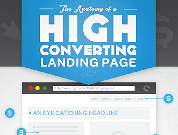
Here is the Anatomy of a perfect Landing Page Infographic
[/mk_fancy_title][vc_single_image image=”3773″ img_size=”full” alignment=”center” onclick=”zoom”][/vc_column][/vc_row][mk_page_section][vc_column][vc_column_text]
Conclusion
There are countless ways and resources out on the web to help with increasing conversions to your landing pages. We highlighted a few that we use for ourselves and our clients to get more subscriptions, leads and sales from their website. Contact us for a consultation on how you can start building highly converting landing pages into your website or as micro-site.
Infographic via Formstack[/vc_column_text][mk_employees employees=”4062″][/vc_column][/mk_page_section]